Many businesses focus heavily on campaign targeting, ad creatives, and offer messaging, but the landing page experience on mobile is often where conversion performance starts to break down. A page may look acceptable on desktop, yet still underperform badly when viewed on a phone. This is one reason responsive landing page design matters more than many businesses think.
For businesses running paid campaigns, mobile experience is not only a design concern. It affects clarity, trust, readability, form completion, CTA visibility, and overall conversion flow. If most traffic comes from smartphones, then weak mobile landing page experience can quietly reduce the value of otherwise strong campaigns.
Why Mobile Experience Matters More on Landing Pages Than Many Businesses Think
For many businesses, a large share of campaign traffic now comes from mobile devices. This means the first real experience a potential customer has with the page often happens on a phone, not on desktop.
That matters because mobile users often:
- scan more quickly
- lose patience faster
- are more sensitive to clutter
- are less likely to tolerate friction
- make quicker decisions about whether to continue or leave
A landing page that looks structured on desktop can still become harder to use on mobile if:
- the headline loses clarity
- the CTA is pushed too far down
- the form feels too long
- sections stack poorly
- proof elements become less visible
- the page feels visually heavy
This is why landing page experience on mobile should be treated as part of campaign performance, not just visual design polish.
What Responsive Landing Page Design Actually Means for Conversion
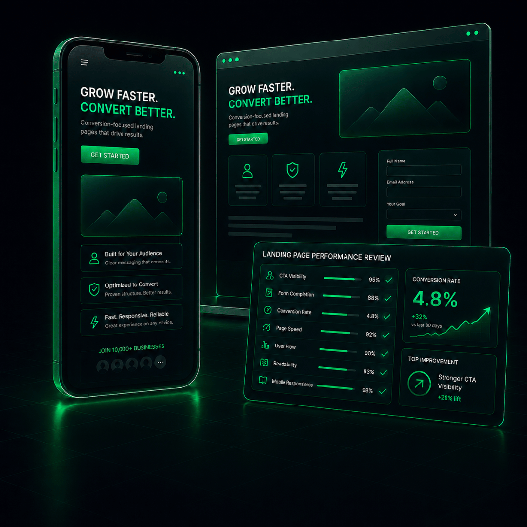
A good responsive landing page design is not just about shrinking the desktop version to fit a smaller screen. It should protect the page’s ability to guide action clearly even when screen space becomes more limited.
That usually means the page should still support:
- clear headline visibility
- strong CTA placement
- easy scrolling flow
- readable content hierarchy
- trust-building visibility
- comfortable form interaction
- visual simplicity without losing meaning
A responsive landing page should help the visitor understand:
- what the offer is
- why it matters
- what to do next
- why the business is trustworthy
- how to take action without friction
When mobile responsiveness is treated seriously, the page becomes easier to use, easier to trust, and easier to act on.
Common Mobile Landing Page Problems That Reduce Performance
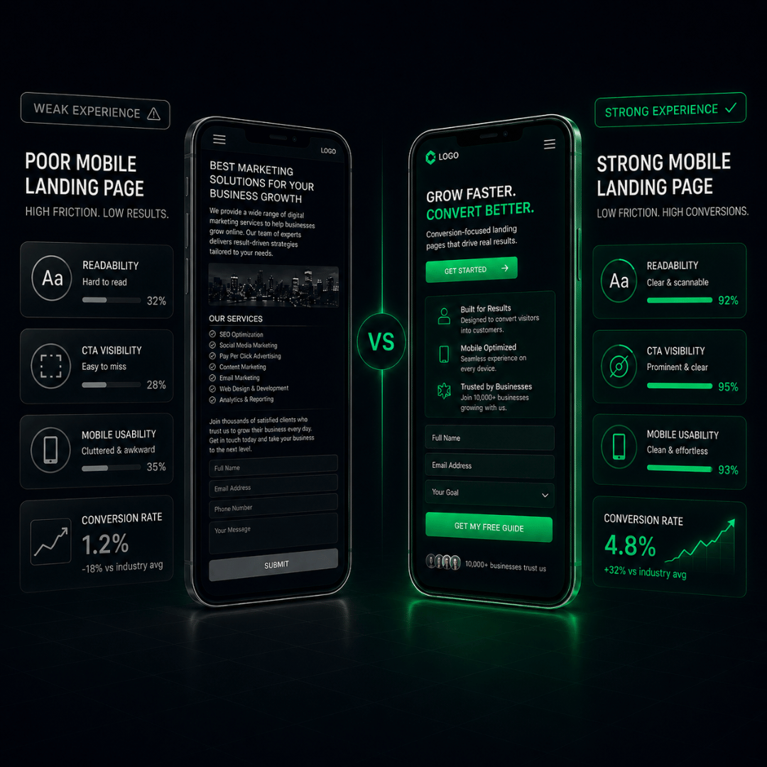
Many mobile landing pages do not fail because the business lacks traffic. They fail because the page becomes harder to use on smaller screens.
| Mobile Problem | How It Affects Performance |
| weak headline visibility | visitors may not understand the offer quickly enough |
| poor CTA placement | action rates may drop because the next step is less obvious |
| excessive content stacking | the page can feel long, repetitive, and harder to scan |
| form friction | mobile users may abandon before completing the form |
| weak proof visibility | trust and reassurance become less effective |
| overly dense design | clarity drops and hesitation increases |
These issues can make a mobile landing page design feel slower, weaker, or less trustworthy even when the core offer itself is still strong.
How Mobile Experience Affects Trust, Attention, and Action Flow
Mobile experience affects more than usability. It also shapes how people feel about the business behind the page.
| Area | Strong Mobile Experience Helps | Weak Mobile Experience Reduces |
| trust | builds confidence and professionalism | creates hesitation |
| attention | improves readability and focus | increases drop-off |
| action flow | makes the next step clearer | weakens CTA interaction |
| form completion | reduces friction | increases abandonment |
A cleaner, more structured mobile experience can improve trust, message clarity, reading comfort, perceived professionalism, and willingness to continue. A weaker mobile experience can reduce confidence in the offer, understanding of the message, form completion, CTA interaction, and conversion intent.
This happens because trust is often influenced by how easy the page feels to use. If the page feels awkward, cluttered, or harder to navigate, the visitor may assume the business itself is less organised or less credible.
What Businesses Should Check on Their Mobile Landing Pages
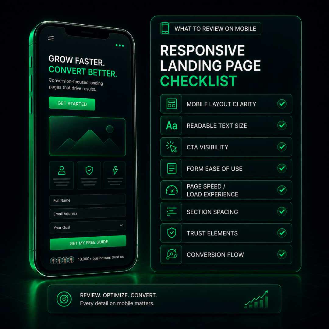
Businesses do not always need a full redesign immediately, but they should review whether the mobile experience is helping or hurting campaign performance.
| What to Check | Why It Matters |
| headline clarity | helps visitors understand the offer quickly |
| CTA visibility | supports faster and clearer action |
| content hierarchy | keeps the page readable and scannable |
| section spacing | reduces visual crowding and fatigue |
| form simplicity | improves completion on smaller screens |
| trust signal visibility | strengthens reassurance and confidence |
| scroll flow | helps the page feel logical and guided |
| mobile readability | keeps copy clear and easy to process |
A stronger responsive landing page should feel easier to follow on mobile, not merely smaller.
Why Good Traffic Can Still Underperform on a Weak Mobile Landing Page
Some businesses assume weak conversion results mean the audience targeting is wrong or the offer is not strong enough. Sometimes that is true. But sometimes the traffic is acceptable and the real issue is the page experience after the click.
This is especially important when:
- ad clicks are steady
- traffic volume is reasonable
- offer relevance seems acceptable
- visitors are arriving but not converting
If most traffic comes from phones, a weak mobile landing page can reduce campaign value by increasing friction after the click.
This can show up as:
- lower enquiry rates
- weak form completion
- shorter engagement time
- poor CTA interaction
- high abandonment despite relevant traffic
A page that looks acceptable on desktop is not always a page that converts well on mobile.
When Better Landing Page Design Support Is Needed
Businesses should consider stronger landing page support when the mobile experience is clearly reducing campaign performance.
| Sign | What It May Mean |
| mobile conversion rates are weaker than expected | the page may not support action clearly on smaller screens |
| forms are not being completed enough | form flow or usability may be causing friction |
| the page feels crowded or unclear on mobile | hierarchy and spacing may need improvement |
| CTA visibility weakens on mobile | action flow may be less effective |
| traffic is strong but results still feel underwhelming | the page experience may be reducing conversion efficiency |
| the page was designed more for appearance than action flow | the design may look acceptable but still fail to convert well |
Better design support may not always mean a full rebuild. In some cases, it may mean improving message hierarchy, CTA placement, form usability, trust block structure, mobile layout refinement, or responsiveness across key sections.
The goal is not just to make the page look better on a phone. The goal is to make the page work better for conversion.
Ready to Improve Your Landing Page Conversion Experience?
A stronger responsive landing page design can improve more than appearance. It can improve trust, readability, CTA flow, form completion, and overall conversion support.
If your campaigns are already driving clicks but mobile conversion is weak, the page experience may deserve more attention. A better landing page should help visitors understand the offer faster and take action with less friction.
Explore our Landing Page Design Service in Malaysia to see how a more conversion-focused landing page can support your campaign goals more effectively.
You can also speak to our team about improving your landing page conversion performance if you want clearer guidance on what may be weakening results on mobile.