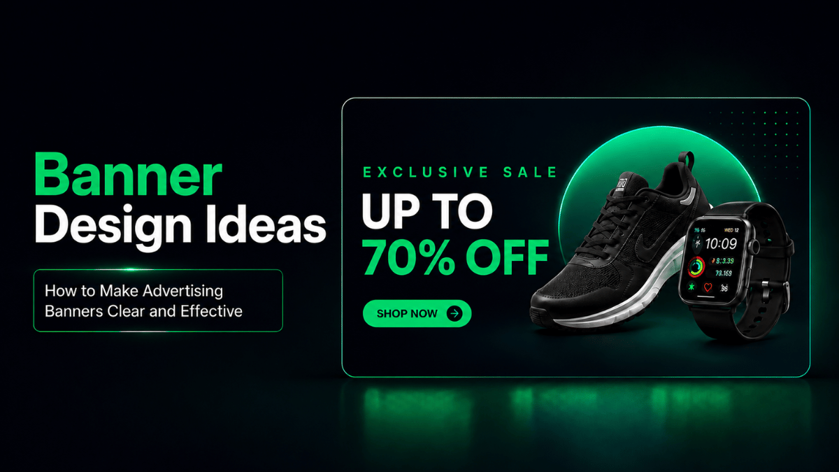
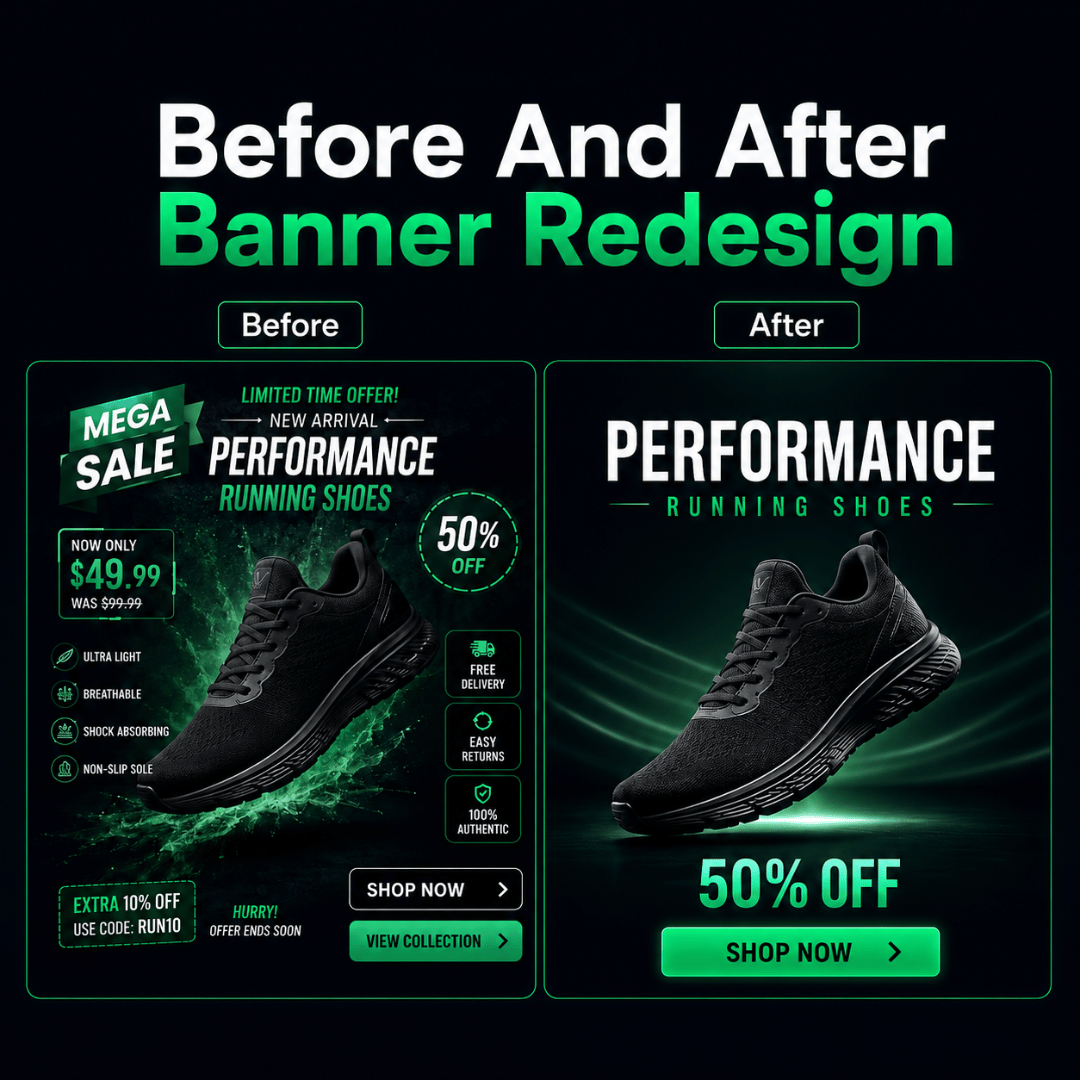
A banner can look polished and still be difficult to understand. Effective banner design is not about adding more visual elements, it is about helping the audience recognise the message, offer and next action quickly.
Good banner design ideas therefore begin with communication rather than decoration. The headline, imagery, typography, branding and call to action should work together to guide attention instead of competing for it.
If you are still deciding which format your campaign requires, our guide to different banner types explains how static, responsive, animated, mobile and other formats differ. For businesses that need clearer message direction and campaign-ready creative, working with a banner design company can also help turn design ideas into more effective advertising banners.
What Makes an Advertising Banner Clear and Effective?
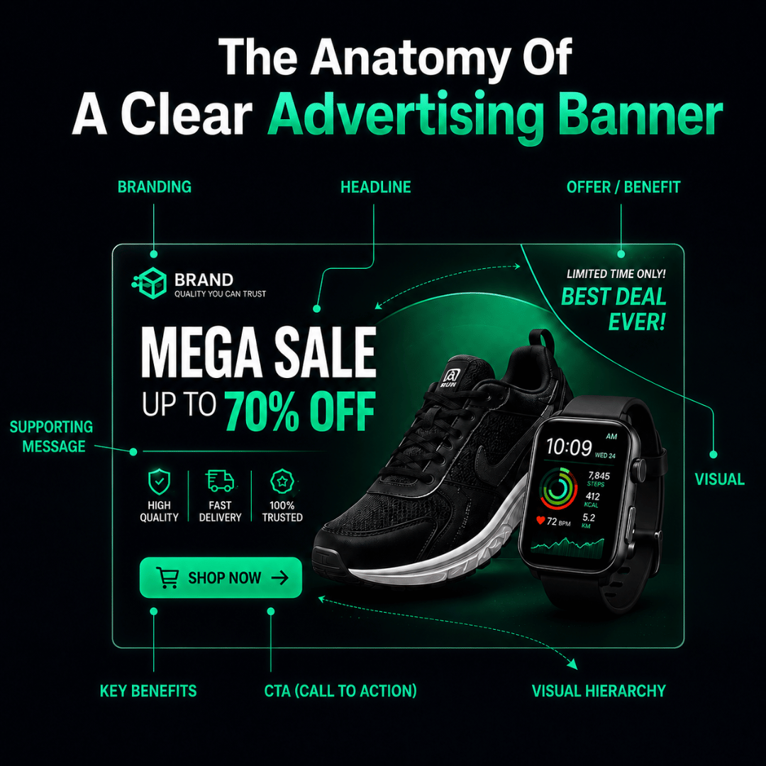
A clear and effective banner design communicates one primary message using a focused headline, relevant visual, readable typography, strong contrast and an identifiable call to action. Every element should guide the viewer towards understanding what is being promoted, why it matters and what action to take next.
| Banner Element | Main Role |
| Headline | Communicates the primary message quickly |
| Offer or Benefit | Explains why the audience should care |
| Visual | Supports or reinforces what is being promoted |
| Supporting Message | Adds only the context needed before the click |
| Branding | Helps the audience recognise the business or campaign |
| CTA | Shows the intended next action |
The aim is not to make every element equally prominent. The design should establish an order so viewers know what to notice first, what to understand next and where to act.
Attractive design may earn attention, but clarity directs that attention towards the campaign message. The most useful banner design ideas are therefore not based on decoration alone, but on making the message, offer and intended action easier to recognise.
Start With the Campaign Objective and Audience
Before choosing colours, images or layout, confirm what the campaign needs to communicate and who needs to understand it.
A retail promotion may need the discount or product to dominate the banner. A service campaign may need to lead with a business benefit. An event banner may prioritise the event name and registration deadline.
The audience also affects how much context is required. Existing customers may already recognise the brand or product, while a new audience may need a clearer explanation of what is being offered.
The design should therefore answer three questions:
- What is being promoted?
- Why should the viewer care?
- What should the viewer do next?
If the banner cannot answer these quickly, adding more decoration is unlikely to solve the problem.
Build the Banner Around One Primary Message
One of the most common challenges when developing banner design ideas is trying to communicate several messages with equal importance.
A banner might include:
- Product name
- Discount
- Free delivery
- Loyalty points
- Campaign period
- Several product benefits
- Multiple CTAs
- Terms and conditions
When every element demands attention, the viewer may struggle to identify what matters most.
Example: Crowded Version
New Collection
30% Off
Free Delivery
Members Earn Points
Limited Time Only
New Colours Available
Shop Now
Clearer Version
30% Off New Collection
Limited Time
Shop Now
The supporting details can appear on the campaign landing page after the click.
A useful principle is:
One banner should communicate one primary message and one intended next action.
This does not mean every banner must contain very little information. It means each piece of information should have a clear role rather than competing for equal attention.
Use Visual Hierarchy to Guide Attention
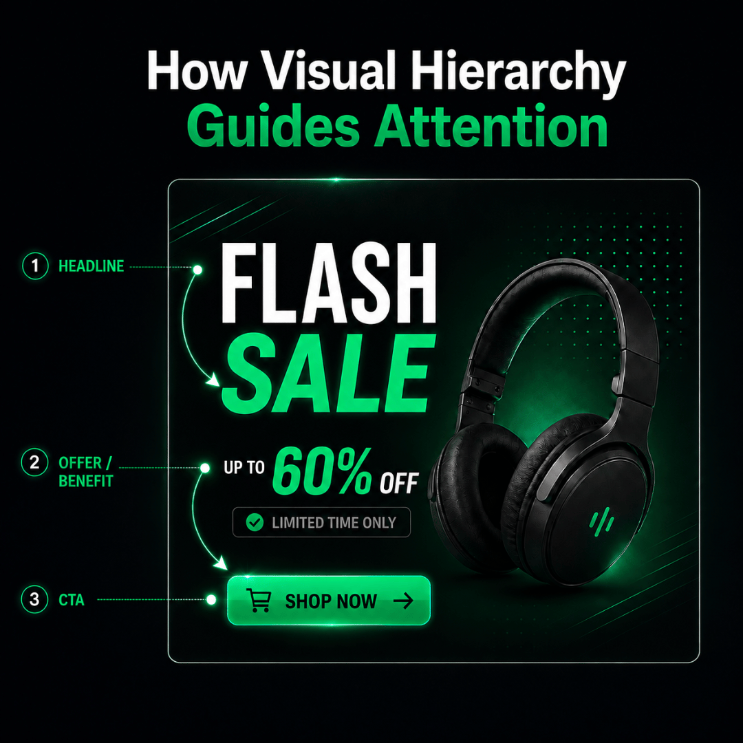
Visual hierarchy determines the order in which viewers notice information.
A practical banner viewing path is:
Headline → Offer or Benefit → CTA
The hierarchy can be strengthened through:
- Size
- Position
- Contrast
- Spacing
- Typography weight
- Visual emphasis
For example, if a promotion is the main reason someone should pay attention, the discount should be easier to notice than the supporting conditions.
White space is also useful because it gives important elements room to stand out.
White space is not wasted space when it helps important information stand out.
Every element added to a banner competes for a limited amount of attention. Removing one unnecessary line may improve clarity more than simply making the headline larger.
Choose Images and Brand Elements That Support the Message
Images should help explain or reinforce what is being promoted.
For example:
- Product promotion: Show the actual product clearly.
- Service campaign: Use imagery connected to the service or outcome.
- Event: Show the event experience, venue or relevant activity.
- Outlet opening: Use the store, location or recognisable environment.
- Remarketing: Reintroduce the product or offer the audience previously viewed.
Generic imagery can make a banner look polished without making the offer easier to understand. For responsive display creative, Google also recommends using high-quality images that keep the product, service or brand as the main visual focus.
The same applies to brand elements. Logos, colours and visual styles help maintain consistency, but the brand should not overpower the message.
A very large logo may reduce the space available for the actual offer without increasing campaign clarity.
The goal is recognition, not competition.
Make the CTA Clear and Easy to Act On
The CTA tells the audience what should happen next. Its wording should match the destination after the click.
| CTA | Suitable Destination |
| Shop Now | Product or promotion page |
| Learn More | Service or information page |
| Register Now | Registration form |
| Get Directions | Store or outlet location |
| Book Now | Booking page |
| Get Quote | Enquiry form |
| Contact Us | Contact or WhatsApp channel |
The CTA should be visually identifiable without overpowering the main message.
After the click, the campaign landing page should continue the same offer and make the next step easy to complete. A strong banner followed by an unclear or unrelated page can break the campaign journey.
Design for Readability Across Screens and Placements
Even strong banner design ideas can become difficult to understand when the final creative is displayed in a smaller placement.
Readability should therefore be checked at the size the audience is likely to see.
Practical considerations include:
- Avoiding very small text
- Keeping sufficient spacing between elements
- Maintaining clear contrast
- Protecting the headline from awkward wrapping
- Avoiding overcrowded narrow layouts
- Keeping the CTA easy to identify
Meta similarly recommends using a clean font in a readable size and sufficient contrast when text appears over advertising creative. Different placements may require the same campaign message to be rearranged rather than simply resized. Platforms such as Meta also allow advertisers to customize your ad creative for different placements so that the presentation better suits the available screen and aspect ratio.
Our guide on choosing the right banner format covers format selection and adaptation in more detail.
The design principle here is simpler: the message should remain easy to understand regardless of where the banner appears.
Practical Banner Design Ideas for Different Campaign Goals
Different campaigns may require different emphasis. The most suitable banner design ideas should follow the campaign goal, audience and offer rather than a visual trend alone.
| Campaign Goal | Recommended Design Direction | Main Focus |
| Promotion | Large offer, clear product visual and direct CTA | Discount or deal |
| Product Launch | Strong product image, short benefit and launch CTA | Newness |
| Service Enquiry | Benefit-led headline, relevant visual and enquiry CTA | Value and trust |
| Event / Registration | Event title, date or deadline and registration CTA | Time and action |
| Outlet Opening | Opening message, location visual and directions CTA | Place and convenience |
| Remarketing | Familiar product or offer with a short reminder | Re-engagement |
Promotion Banner
Let the offer do most of the work.
If “30% Off” is the strongest reason to pay attention, it should not compete equally with six product features.
Product Launch Banner
Give the new product enough visual space to become the focal point. Use supporting copy to explain one useful benefit rather than every specification.
Service Enquiry Banner
Lead with the problem solved or value provided.
For example:
Reduce Manual Reporting
Monthly Dashboard Setup
Get Quote
This is often clearer than filling the banner with a long list of service capabilities.
Event or Registration Banner
Make the event name, date and next action easy to scan. If registration closes soon, the deadline may deserve stronger emphasis.
Outlet Opening Banner
Prioritise the opening message and location. The CTA may be Get Directions rather than a generic Learn More.
Remarketing Banner
The audience may already recognise the product. The banner can focus on a reminder, benefit or relevant offer instead of introducing everything again.
Common Banner Design Mistakes to Avoid
Many banner problems come from adding too much rather than too little. When reviewing banner design ideas, businesses should therefore consider what can be removed or simplified before adding more visual elements.
| Common Problem | Better Approach |
| Too many competing messages | Prioritise one main offer or idea |
| Large amounts of small text | Keep only information needed before the click |
| Weak visual hierarchy | Make the headline, offer and CTA visually distinct |
| Irrelevant stock imagery | Use a visual that supports the campaign message |
| Several competing CTAs | Select one intended next action |
| Poor contrast | Improve readability between text and background |
| Branding dominates the layout | Keep branding recognisable but secondary to the message |
| Same layout forced into every size | Adapt the arrangement to protect clarity |
One important mistake is assuming that a more decorative banner will automatically perform better.
Design cannot guarantee clicks, leads or sales. Targeting, offer strength, placement, landing-page experience and follow-up still influence results.
The purpose of design is to make the campaign message easier to notice and understand.
Banner Design Review Checklist
Before publishing any of these banner design ideas, review the final creative from the audience’s perspective.
- Can the main message be understood quickly?
- Is there one clear offer or idea?
- Is the headline visually easy to identify?
- Does the image support the message?
- Is the text readable at actual display size?
- Is the CTA clear?
- Does the CTA match the destination?
- Is the branding visible without becoming distracting?
- Does the layout remain clear across required placements?
- Can anything unnecessary be removed?
A useful final test is to look at the banner for only a few seconds.
If the viewer cannot quickly explain what is being promoted and what action to take, the design may still need simplification.
Professional support becomes more useful when businesses need to turn banner design ideas into several campaign-ready variations with consistent messaging, layouts and production quality.
Businesses preparing campaign creative can explore Kawan Elite’s Banner Ads Design Services for support with messaging, hierarchy, CTA direction and campaign-ready banner preparation.
Clear Banner Design Makes the Next Action Easier to Understand
Effective banner design is not about fitting as much information as possible into the available space.
The strongest banner design ideas prioritise one main message, establish a clear visual hierarchy, use relevant imagery and make the intended action easy to identify.
Good creative helps the audience move through three simple stages:
Notice → Understand → Act
Before publishing, review whether every element contributes to that journey. If something does not strengthen the message, offer or next action, consider removing it.
Need advertising banners with clearer offer messaging, stronger hierarchy and CTA direction? Explore Kawan Elite’s Banner Ads Design Services for campaign-ready creative support.